This post builds on the survival analysis introduction and delves deeper into the “how” and “why” of the Kaplan-Meier (KM) estimator.
Motivation & Goals
We would like to obtain a non-parametric estimation of the survival probability over time. In addition, we would like to be able to compare the resulting survival curves with each other to determine, for example, which treatment is more effective.
The Kaplan-Meier Estimator
The KM estimator is expressed as
$\begin{aligned} \hat{S}(t) = \prod_{y_{(i)}\leq t} \hat{p_i} = \prod_{y_{(i)}\leq t} \left[ \frac{n_i -d_i}{n_i}\right] = \prod_{i = 1}^{k} \left[ \frac{n_i -d_i}{n_i}\right] \end{aligned}$ where $y_{(k)} \leq t < y_{(k+1)}$.
- $n_i$ describes the number of people that are alive and that have not been censored just prior to time $t$ ($=y_{(i)}$).
- $d_i$ describes the number of people that died at $y_{(i)}$.
Now, where does this formula actually come from?
It comes from applying the multiplication rule $P(A \cap B) = P(B\vert A)P(A)$ repeatedly. This leads us to express the survivor function or the probability of survival as
$S(t) = P(T>t) = \prod_{y_{(i)}\leq t} \hat{p_i}$
- $\hat{q_i} = \frac{d_i}{n_i}$
- $\hat{p_i} = 1-\hat{q_i}= 1 - \frac{d_i}{n_i} = \left[ \frac{n_i-d_i}{n_i} \right]$
If we would observe no censoring, we could just take the empirical estimator instead.
The Kaplan-Meier Estimator in Practice
Now, let’s have a look at how we would implement this in practice. Let’s load a dataset and visualize some survival times. The data is taken from the lifelines package (Moeschberger dataset).
import numpy as np
import pandas as pd
import lifelines
from lifelines.datasets import load_kidney_transplant
from lifelines import KaplanMeierFitter
from lifelines.statistics import logrank_test
import plotly.express as px
import plotly.graph_objs as go
import os

path = os.path.realpath('..')

df = lifelines.datasets.df = lifelines.datasets.load_kidney_transplant().rename_axis('patient').reset_index()

df['start'] = 0
df['end'] = df.time

new = df[0:11]
fig = px.line(new, x='time', y='patient',color='patient', title='Survival Time of Patients')
for r,col in new.iterrows():
    fig.add_shape(type="line", x0=new.start[r], x1=new.end[r],y0=new.index[r],y1=new.patient[r], line_width=2, line_dash="dash", line_color="blue")
fig
Now, we create a new dataframe that contains a sorted list of the number of deaths and the number of people at risk over time.
def KM(df):
"""Calculate KM estimator manually.
Following https://allendowney.github.io/SurvivalAnalysisPython/02_kaplan_meier.html"""
ts = df.time.unique()
ts.sort()
at_risk = pd.Series(0, index=ts)
for t in ts:
k = (t <= df['end']) # true false if time t is below or equal end time
at_risk[t] = k.sum() # sum trues to get all cancer patients by duration
d = pd.Series(0, index=ts)
for t in ts:
# create condition that patient died and that death was observed
k = (df['death'] == 1) & (t == df['end'])
# sum the true values for the above condition
d[t] = k.sum()
dff = pd.DataFrame(dict(death=d,
at_risk=at_risk), index=ts)
dff['hazard'] = dff.death/dff.at_risk
# calculate values for survivor curve
dff['surv'] = (1-dff.hazard).cumprod()
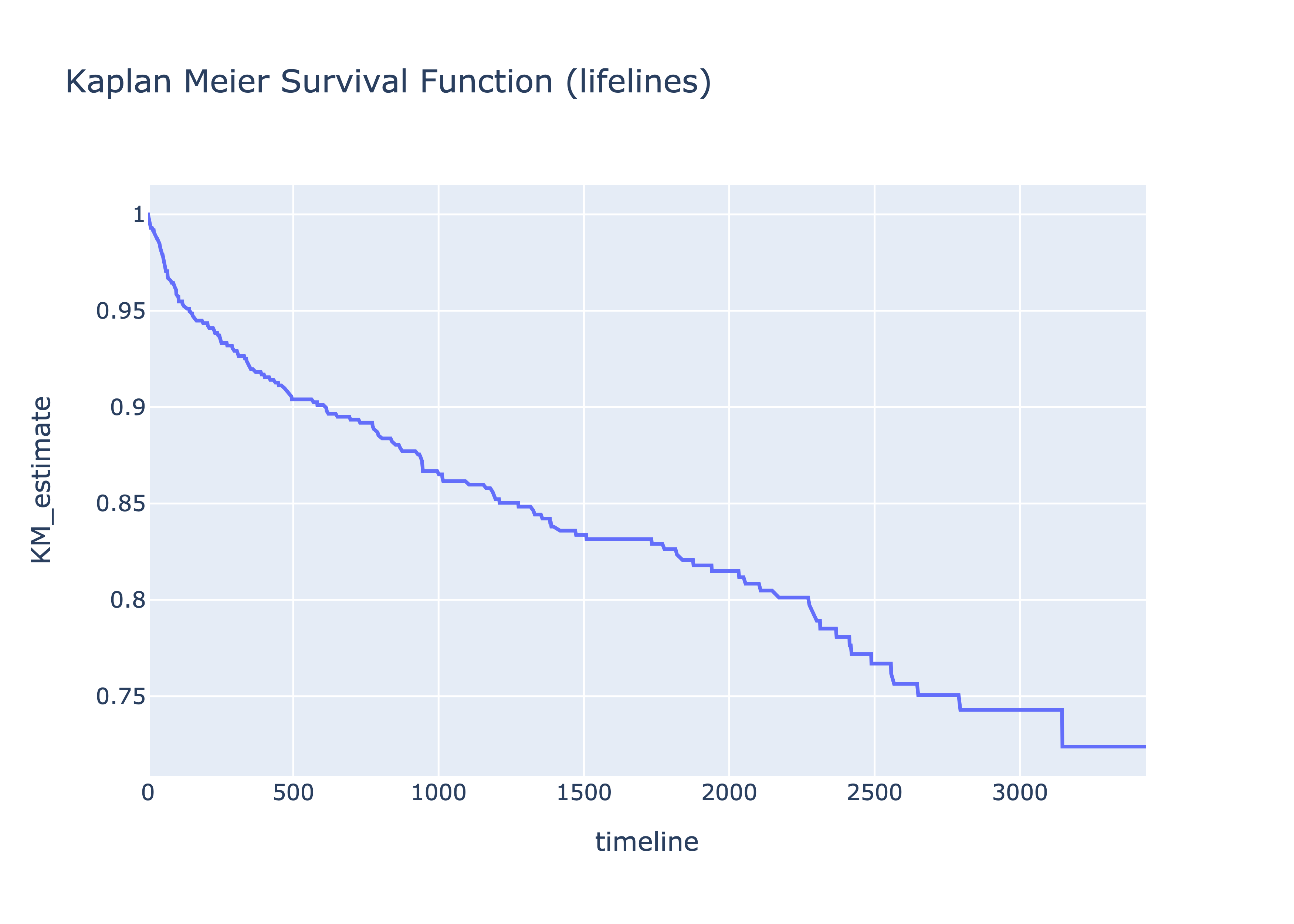
return dffNow, we plot the the results with Plotly Express and compare with the lifelines results.
dff = KM(df)
dff = dff.reset_index()
fig1 = px.line(dff, x='index',  y='surv', title='Kaplan Meier Survival Function', labels={'surv':'KM_estimate', 'index':'timeline'})
fig1

kmf = KaplanMeierFitter()
kmf.fit(df.time, df.death)
est = kmf.survival_function_
est = est.reset_index()
fig2 = px.line(est, x='timeline',  y='KM_estimate', title='Kaplan Meier Survival Function (lifelines)')
fig2
And voila the curves are actually the same.

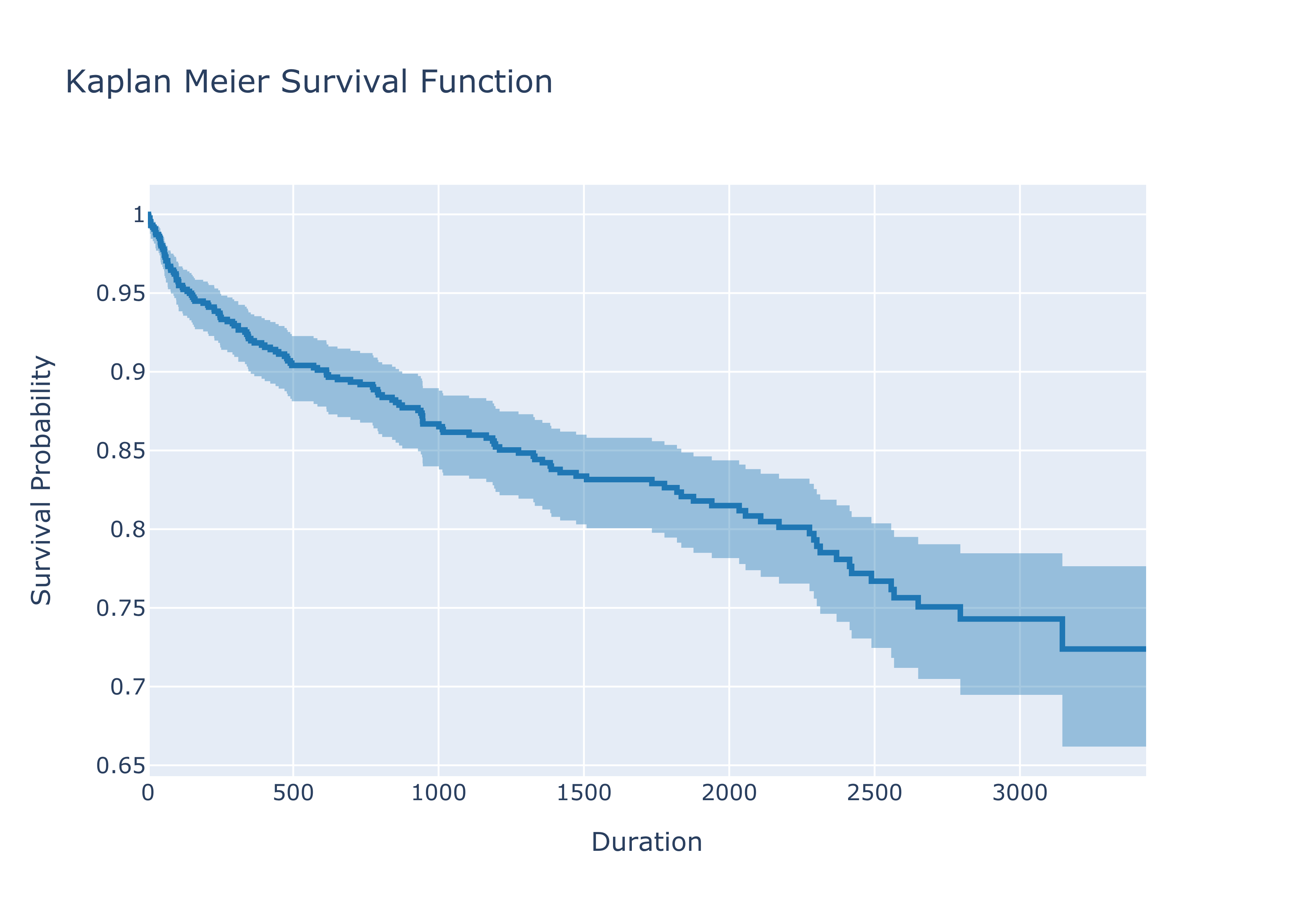
Confidence Intervals - Greenwood’s Formula
Now it is time to actually look at the estimator from more statistical perspective - what are the confidence intervals of the estimator?
Commonly for large samples we use the Greenwood’s formula to obtain the confidence intervals. There are, however, two versions of Greenwood’s formula. In line with the lifelines package, the focus will be on the “exponential” Greenwood formula of the confidence interval:
$\exp(-\exp(c_{+}(t))) < S(t) < \exp(-\exp(c_{-}(t)))$
where
$c_{\pm} = \log(-\log)\hat{S}(t)) \pm z_{\alpha/2}\sqrt{\hat{V}}$
and
$\hat{V} = \frac{1}{(\log \hat{S}(t))^2} \sum_{t_i\leq t} \frac{d_i}{n_i(n_i-d_i)}$
and the KM estimator
$\hat{S}(t) = \prod_{t_i\leq t} (1 - \frac{d_i}{n_i})$
All details and derivation can be found here.
Plotting the survivor curve with the confidence interval using the above formula looks like this:
fig = go.Figure()

fig.add_trace(go.Scatter(
    x=kmf.survival_function_.index, y=kmf.survival_function_['KM_estimate'],
    line=dict(shape='hv', width=3, color='rgb(31, 119, 180)'),
    showlegend=False
))

fig.add_trace(go.Scatter(
    x=kmf.confidence_interval_.index,
    y=kmf.confidence_interval_['KM_estimate_upper_0.95'],
    line=dict(shape='hv', width=0),
    showlegend=False,
))

fig.add_trace(go.Scatter(
    x=kmf.confidence_interval_.index,
    y=kmf.confidence_interval_['KM_estimate_lower_0.95'],
    line=dict(shape='hv', width=0),
    fill='tonexty',
    fillcolor='rgba(31, 119, 180, 0.4)',
    showlegend=False
))

fig.update_layout(
    title= "Kaplan Meier Survival Function",
    xaxis_title="Duration",
    yaxis_title="Survival Probability"
)

fig.show()
Log-Rank Test
The Kaplan-Meier estimator allows visualizing and comparing survival probabilities of several groups of patients or users. In a medical setting we would look at groups that have received, for example, different treatments.
In order to determine a statistically signicant difference between the groups we need to apply the log rank test.
Let’s look at the case of comparing two groups. The log rank statistic equals $\frac{\sum_{i=1}^k (O_i - E_i)}{\sqrt{\sum_{i=1}^k Var(O_i-E_i)}}$ where $i=1,2$ for the two groups.
$O_i - E_i = m_{if} - e_{if}$ where $m_{if}$ depicts the number of objects that fail at failure time $f$ for group $i$. Now, $e_{if}$ represents the expected numbers of events and is calculated as $e_{1f} =\left (\frac{n_{1f}}{n_{1f}+n_{2f}} (m_{1f} + m_{2f})\right)$ where $n_{if}$ depicts the number of objects in the risk set for group $i$ at the different failure times $f$. The first part of the equation represents the proportion of objects in the risk set fro group 1 and the second part represents the number of failures for both groups.
An example of the calculation of the variance from Kleinbaum and Klein (2012) for two groups would be the following: $\sqrt{\sum_{i=1}^k Var(O_i-E_i)} = \sqrt{\sum_{i=j} \frac{n_{1f} n_{2f}(m_{1f}+m_{2f})(n_{1f}+n_{2f} -m_{1f} -m_{2f})}{(n_{1f} + n_{2f})^2 (n_{1f}+n_{2f} -1)}}$
This allows us now to test the $H_0$ that there is no difference between the survival curves. The log-rank statistic follows the Chi-square distribution ($\approx \chi^2$) with one degree of freedom under null hypothesis.
Enough of the theory, let’s look at a code example. We create two groups using a random number generator and compare them
# create two groups artificially
df['status'] = np.random.randint(0,2, df.shape[0])

df0 = df[df['status']==0]
df1 = df[df['status']==1]

kmf = KaplanMeierFitter()
kmf.fit(df0.time, df0.death)

fig = go.Figure()

fig.add_trace(go.Scatter(
    x=kmf.survival_function_.index, y=kmf.survival_function_['KM_estimate'],
    line=dict(shape='hv', width=3, color='rgb(31, 119, 180)'),
    showlegend=False
))

kmf.fit(df1.time, event_observed=df1.death)

fig.add_trace(go.Scatter(
    x=kmf.survival_function_.index, y=kmf.survival_function_['KM_estimate'],
    line=dict(shape='hv', width=3, color='rgb(255,0,0)'),
    showlegend=False
))

fig.update_layout(
    title= "Comparison: Kaplan Meier Survival Functions",
    xaxis_title="Duration",
    yaxis_title="Survival Probability"
)

fig.write_image(path +"/assets/images/comp_surv.png", scale = 5)
fig.show()
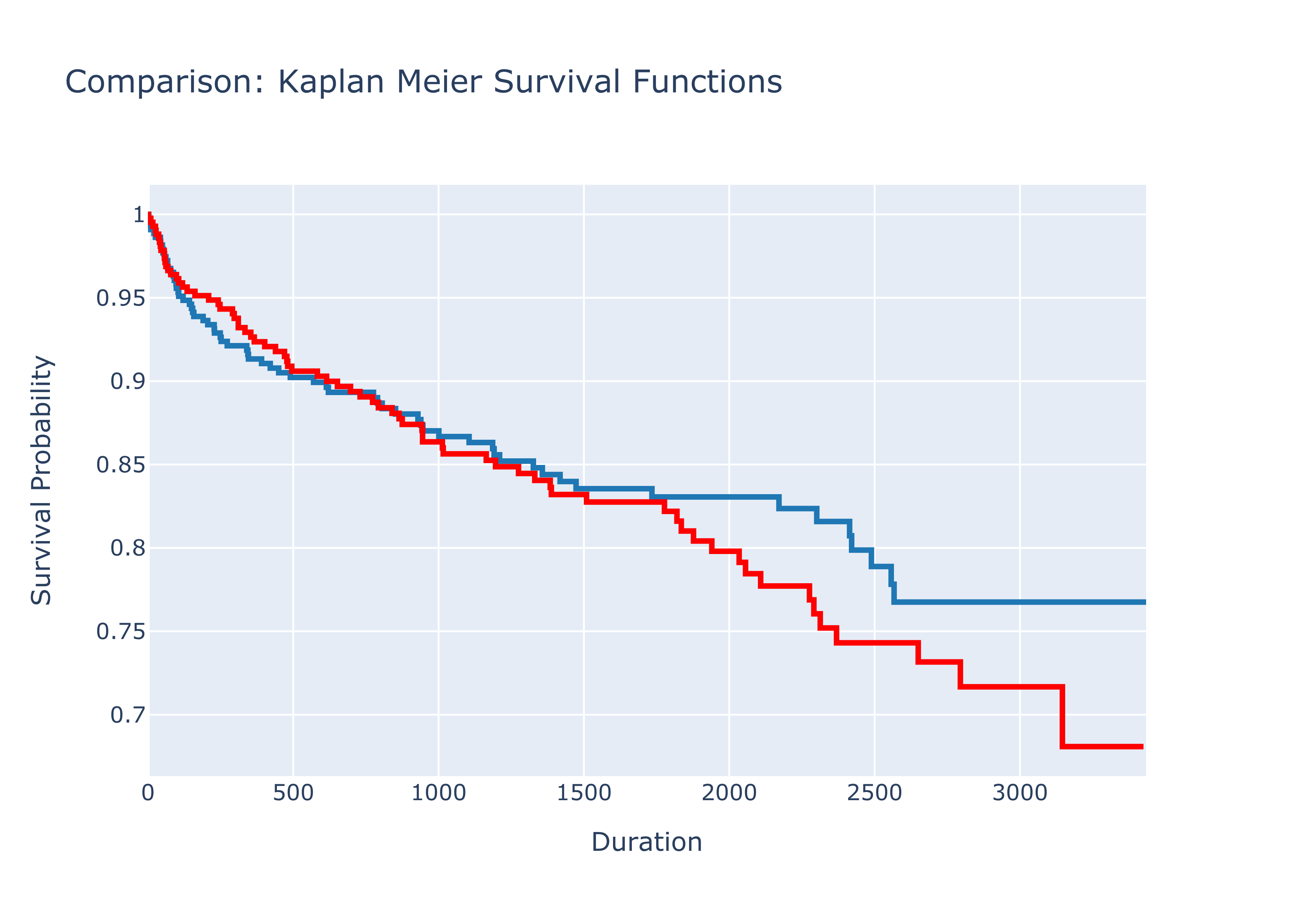
results = logrank_test(df0['time'], df1['time'], event_observed_A=df0['status'], event_observed_B=df1['status'])
results.print_summary()
In our case, the null hypothesis can be rejected and we would argue that there is a significant difference between the two groups. Since a random number generator has been used, the results for you running the code might be different.
For completeness it shall be mentioned that a variety of tests to compare the survivor curves exist: Wilcoxon, Tarone-Ware, Peto, and Flemington-Harrington. These tests enable us putting a stronger weight at certain timesteps which may be appropiate when we believe that the treatment exposure is stronger at a certain failure time, for example at the beginning of the study.
You can get the notebook here.
Sources
- Kleinbaum, D. G. & Klein, M. Survival analysis: a self-learning text. (Springer, 2012).
- Tableman, M. Survival Analysis Using S R*. (2016).
- Rodriguez, G. GR’s Website. https://data.princeton.edu/wws509/notes/c7s1.
- Sawyer, S. The Greenwood and Exponential Greenwood Confidence Intervals in Survival Analysis. (2003).